View Faculty Dashboard
The Faculty Dashboard allows faculty to view usage statistics for groups of users. It also enables you to compare the usage of an individual user with that of the group as a whole.
This short guide will show you how to:
View Faculty Dashboard
Using your preferred web browser, navigate to the URL for your Apporto system, for example, “mycollege.www.apporto.com”, and log in to the system using credentials.
Click the Analytics ![]() icon in the Navigation panel.
icon in the Navigation panel.
Initially, the ‘Admin Dashboard’ displays.
Click on the Faculty Dashboard tab.
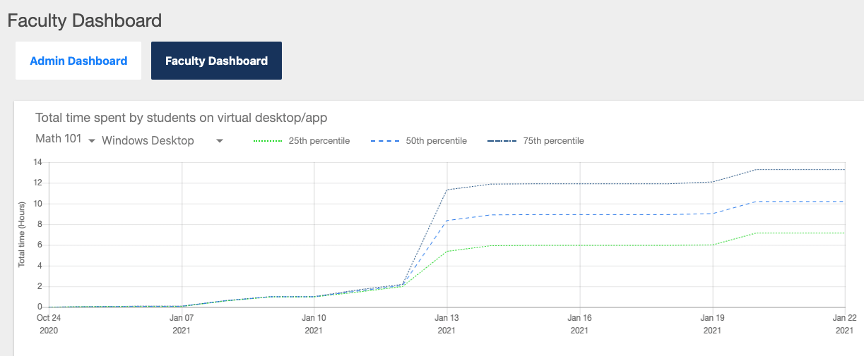
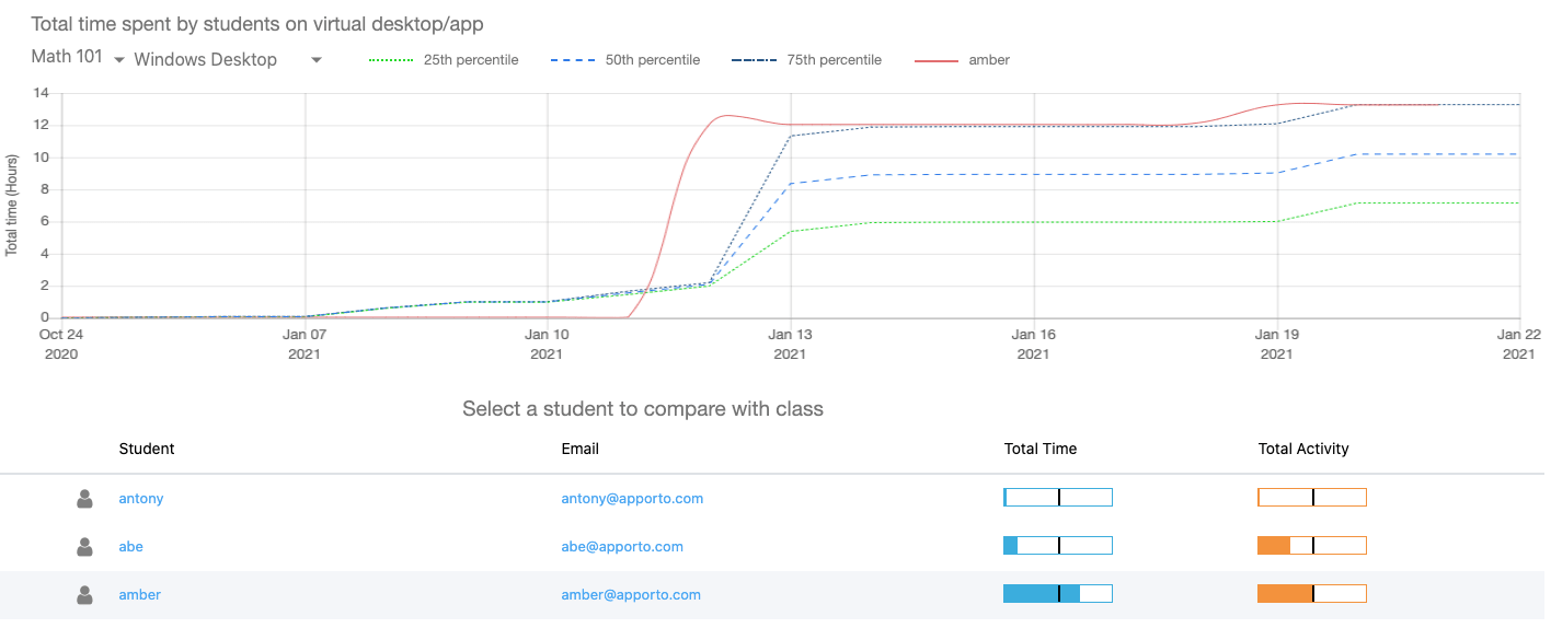
The Faculty Dashboard shows usage statistics for groups of users (for example, a class of students). The first chart plots the total amount of time spent in Apporto by percentiles (25th, 50th, and 75th).
Select the desired group from the first drop-down menu.
Select the desired desktop or app from the second drop-down menu.
The screen refreshes to display usage for the selected group and desktop or app.
The first drop-down menu allows you to choose from groups for which your Role has permissions. The second drop-down menu lists all apps/desktops published to the selected group.
If no data exists for the selected group and desktop/app combination, the message ‘NO DATA AVAILABLE’ displays.
View Statistics for Individual Users
Scroll to the bottom of the Faculty Dashboard to see usage statistics for individual users.
A table shows a list of students along with their Email, Total Time, and Total Activity.
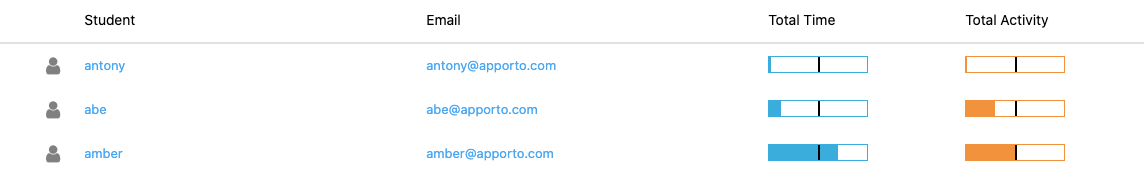
The black line in the middle of the Total Time and Total Activity bars represents the 50th percentile. This allows you to easily see whether a student is spending more or less time than the typical student.
If you notice a student is lagging behind their classmates (or appears not to have been able to access the system), their email is provided so you can easily reach out to offer assistance.
Compare an Individual with the Group
To compare usage for an individual student with the group, cursor over the student’s row in the table and click to select the student.
The chart refreshes and a red line shows statistics for the individual.