View Admin Dashboard
The Admin Dashboard provides administrators with high-level usage statistics, including the total number of sessions served, concurrent users, which apps are used the most, and where users login from.
If more granular data is required, you may export sessions data from the Sessions screen. Exported data is downloaded to a CSV file which you may then import into Excel, Tableau, or another tool for further analysis.
View Admin Dashboard
Using your preferred web browser, navigate to the URL for your Apporto system, for example, “mycollege.www.apporto.com”, and log in to the system using your Admin credentials.
Click the Analytics  icon in the Navigation panel.
The ‘Admin Dashboard’ displays.
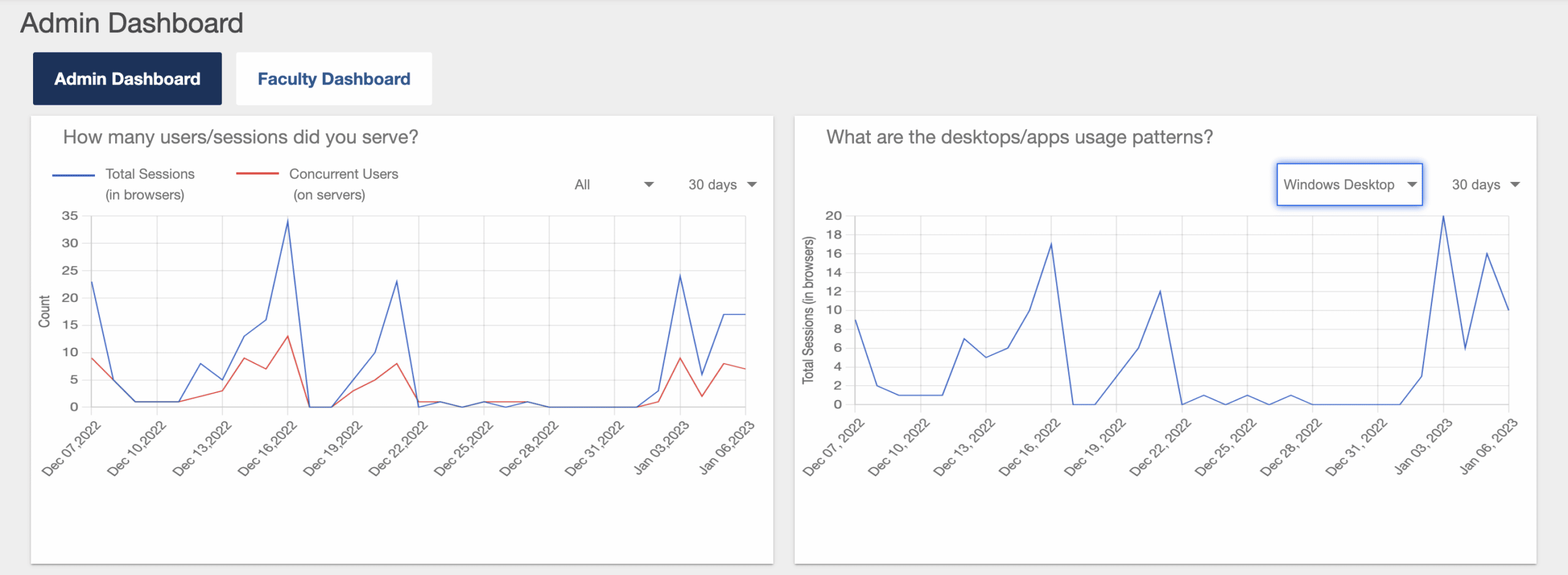
The Admin Dashboard provides the following four charts showing usage statistics for your Apporto service.
Users and Sessions
How many users/sessions did you serve?
This graph shows the total number of sessions and concurrent users for a specified app/desktop and time period.
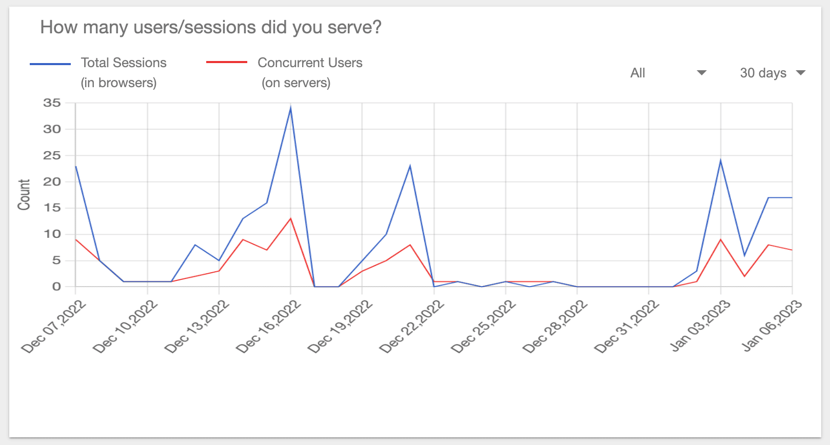
Select the application or desktop for which you wish to view statistics from the drop-down menu. The default selection is All.
Select the time period for which you wish to view statistics from the drop-down menu: Current, 7, 30, 90 or 365 days. The default selection is 30 days.
When Current is selected, hourly statistics are shown. When 7, 30, 90, or 365 days is selected, daily statistics are shown.
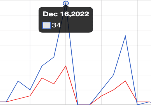
Mouse over a node on the graph to view usage statistics for the associated hour or day.
 .
.
Desktop/App Usage Patterns
What are the desktops/app usage patterns?
This graph shows the number of sessions delivered for a specific desktop or app for a specified time period.
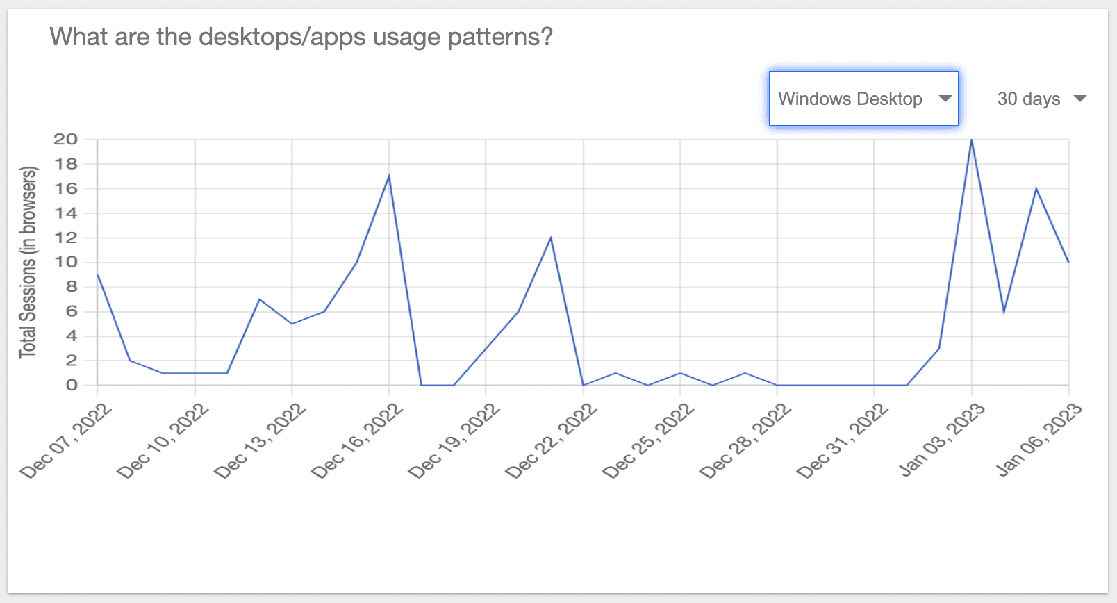
Select the application or desktop and time period for which you wish to view statistics from the drop-down menu.
Select the time period for which you wish to view statistics from the drop-down menu Current, 7, 30, 90 or 365 days. The default selection is 30 days.
When Current is selected, hourly statistics are shown. When 7, 30, 90, or 365 days is selected, daily statistics are shown.
Mouse over a node on the graph to view usage statistics for the associated hour/day.
Desktop/App Usage Frequency
How frequently are your apps/desktops used?
This graph shows the frequency of usage for all desktops and apps defined for your system.
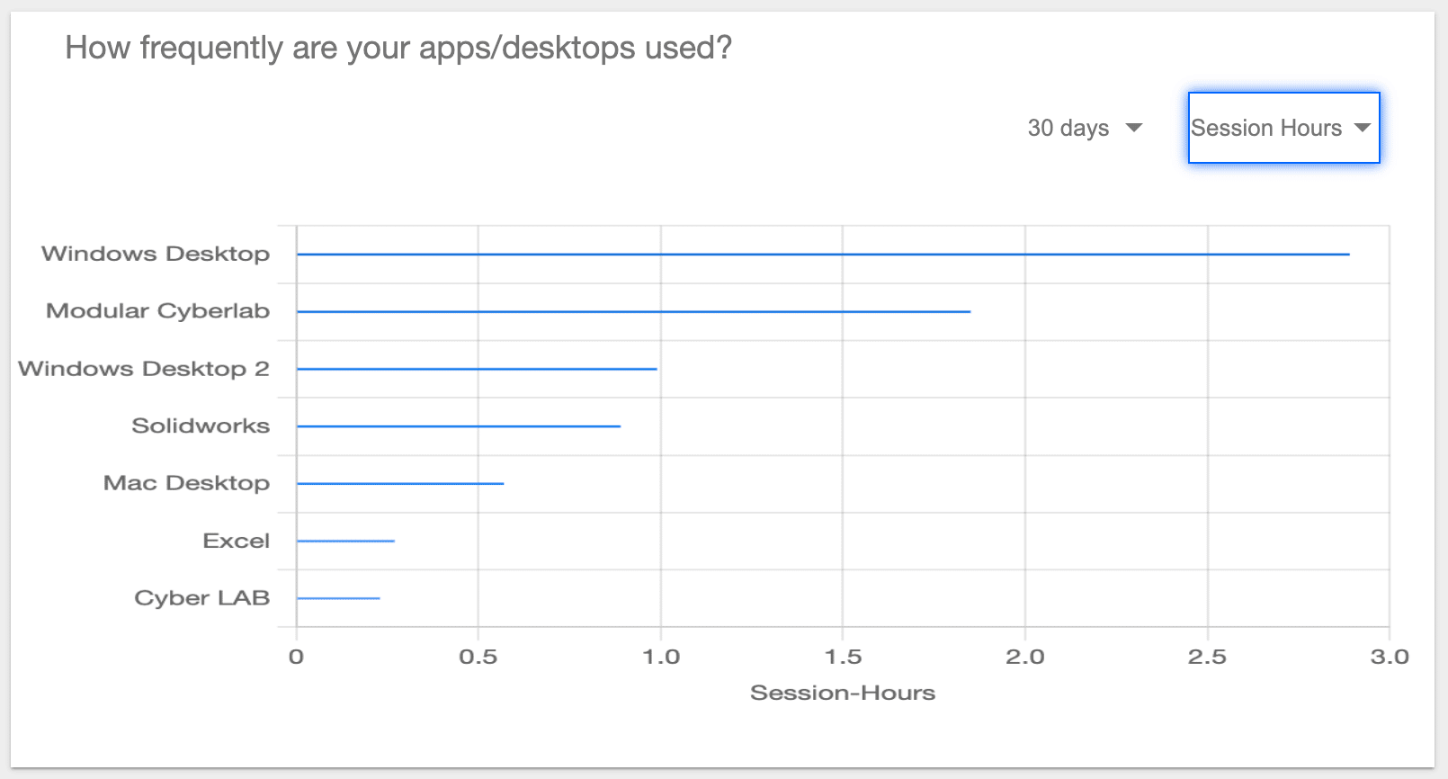
Select the time period for which you wish to view statistics from the drop-down menu: Current, 7, 30, 90 or 365 days. The default selection is 30 days.
Select the desired usage statistic: Session Hours, Users or Sessions. The default selection is Session Hours.
Mouse over a bar on the graph to view usage statistics for the associated desktop/app.
End User Location
Where are users logging in from?
This map shows where users are located geographically when they logged into Apporto. The user location is an approximation based on geo-ip mapping.
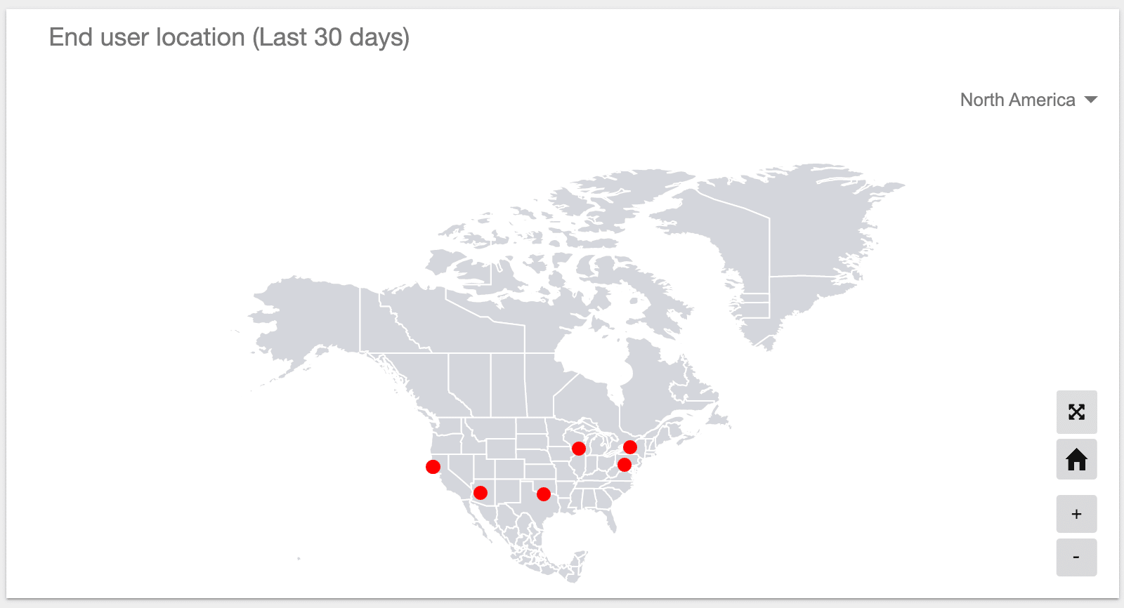
Red dots show clusters of users in a particular area. Larger dots indicate more users.
Select World from the drop-down menu to toggle to a global map view. The default selection is North America.
Click on the cross arrows button to view the map larger. Click the home button to collapse the view.